The government is hailing this week’s employment statistics as a big win. And on the face of it, it’s easy to see why: employment is up and unemployment down.
But FactCheck readers tend to express more doubts about the coalition’s record on jobs than just about anything else.
There is a lot of scepticism out there, with people wondering how much of the rise in employment is down to part-time, temporary and zero-hours jobs.
Labour leader Ed Miliband did not tackle the employment figures head-on at today’s Prime Minister’s Questions. Instead, he talked about falling living standards, claiming that families are £1,600 a year worse off.
Let’s see what the official figures tell us. All the claims are from Wednesday’s ding-dong in the Commons.

 “He told us there would be no jobs. We have jobs.”
David Cameron
The “he” in that claim is the shadow chancellor, Ed Balls, who in October 2011 said the government’s belief that private sector job creation would outweigh cuts to the public sector was a “complete fantasy”.
But subsequent events have proved Mr Balls wrong. The latest data from the Office for National Statistics (ONS) shows that the private sector employed more than 2 million more people in the third quarter of 2014 than it did in the first quarter of 2010 (just before the election).
Over the same period public sector employment fell by 412,000. This is using figures which exclude the effects of major reclassifications – like switching sixth-form colleges and Royal Mail from public to private sector – which some people have suggested skew the numbers in the government’s favour.
Total employment has now risen by 1,753,000 people under the coalition, if we agree with the government that the last quarter before the general election, February-April 2010, is the natural place to start counting.
Quality and quantity
It is sometimes suggested that a significant amount of rising employment is made up of temporary, self-employed or part-time workers.
There is some evidence of a rise of self-employment in the figures. The number of employees has risen by just under 5 per cent since the election, while the number of people in self-employment has gone up by just under 14 per cent.
But the number of full-time and part-time workers has risen by almost exactly the same proportion – about 6 per cent.
The percentage of all employees who are doing a temporary job, for various reasons, has risen very slightly under the coalition, from 6 to 6.4 per cent.
The issue of people working on zero-hours contracts is a tricky one. The ONS has published figures suggesting that 2 per cent of people in employment are on a zero-hours contract – or about 622,000 people. But we don’t know whether that is more or less than in 2010.
Last year the chairman of the UK Statistics Authority, Sir Andrew Dilnot, gave Labour a slap on the wrist over a dodgy press release that claimed there had been a “huge increase” in zero hours contracts under David Cameron, when there was no evidence of a rise.
Foreign workers
Over the last year there were 445,000 more UK nationals in employment and 230,000 non-UK nationals. So about one third of the total recent rise in employment is accounted for by migrant workers.
The non-UK share of employment is almost the same (31 per cent) over the whole of this parliament so far.
There have been periods in the past when ministers were able to claim that as much as 90 per cent of rising employment was made up of British citizens, but it looks that trend has changed now.
Over the past year then number of UK nationals in employment has gone up by just 1.6 per cent, compared to a whopping growth rate of 8.6 per cent for non-UK workers.
 “Families are 1,600 a year worse off.”
Ed Miliband
This is a familiar Labour line of attack. The basic point is that real wages (that’s wages adjusted for inflation) have fallen under the coalition.
This is undoubtedly true: earnings (blue) rose at a lower rate than inflation (yellow) from mid-2008 until very recently, according to the ONS:
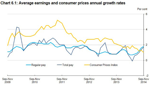
Labour uses RPI inflation and total average weekly earnings to get the figure that the average household is now £1,600 a year worse off compared to May 2010.
We actually think it’s just over £1,700 on the latest figures, so the point still stands, although in recent months earnings have started to rise above inflation, so Labour may have to revise their figure down before long.
David Cameron shot back by saying that Labour’s figures ignore the government’s cuts to the income tax threshold, which is true. Mr Miliband countered by saying that the coalition has raised VAT – also true.
They could probably go on all afternoon like that, trading examples of when the government has raised or lowered taxes over the years, but it’s actually fairly simple to find out how the government itself says all these different policies have cumulatively affected people’s incomes.

The Treasury publishes figures which show how all tax and benefits policies since George Osborne’s first budget in 2010 to last year’s autumn statements have changed annual incomes.
We can see from the final column in the graph that the overall effect on all households is pretty flat, but it makes a big difference which income bracket you are in.
The very richest have been hit the most by government policies, and for middle earners the effect is a giveaway that more than cancels out the £1,600-a-year cost-of-living deficit identified by Labour.
For people at the very bottom of the income distribution, the sum effect on income of all the government’s policies appears to be a big fat zero.


