A damning new report has criticised politicians’ efforts to improve social mobility.
The research, by the Social Mobility Commission, warns that for years policies have “failed to deliver enough progress in reducing the gap between Britain’s ‘haves and have nots’.”
“The old agenda has not delivered enough social progress,” it says. “The policies of the past have brought some progress, but many are no longer fit for purpose in our changing world.”
So, how bad is it? Here are ten key graphs from the Social Mobility Commission’s report that paint a picture of the problem.
1. Child development equality has flatlined
This graph shows the percentage-point gap between deprived and non-deprived areas for children who reach a good level of development by the age of five. It was improving, but has now flatlined.

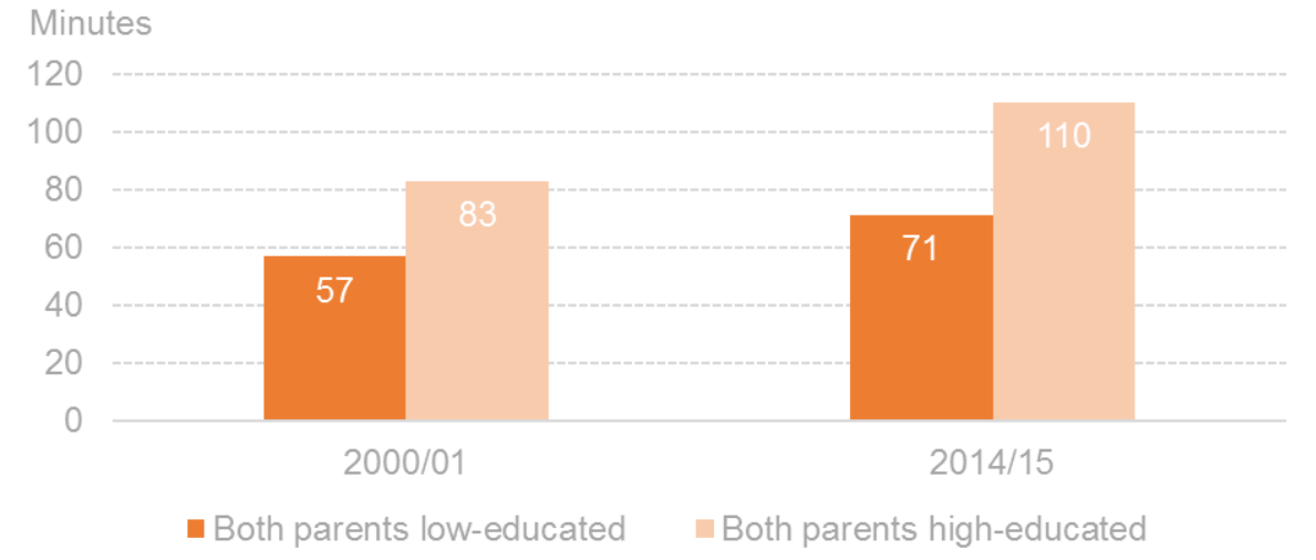
2. If your parents are not highly educated, you receive less child development time
The gap has got wider over time. Here, we can see the number of minutes that parents spend on their child’s development per day, in 2001/01 and 2014/15.
3. There’s still a big gap between rich and poor children at school
This shows the percentage of pupils who achieve at least level 2 in Key Stage 1. It’s broken down by those children who are eligible for free school meals (FSM), and those who are not.

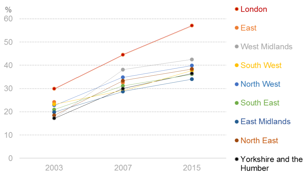
4. Attainment for poorer children is improving quicker in London than the rest of England
As above, this graph is based on pupils who are eligible for free school meals. It shows the percentage who achieved at least five A*-C grades at GCSEs, or equivalent. (We’ve added the coloured lines on to the Social Mobility Commission’s graph to make it easier to track each region’s progress).
5. Good school leadership is linked to location and deprivation
The percentage of secondary schools with “good and outstanding” leadership is far lower in deprived areas outside London. This graph shows the breakdown by both region and deprivation in 2016.

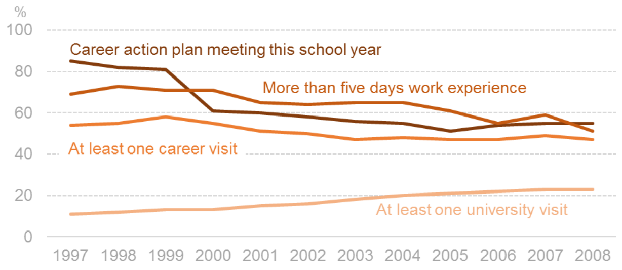
6. Careers advice in schools is declining
This one shows the percentage of schools offering career support between 1997 and 2008. Every category of support has decreased except university visits, which have slowly become more widespread.
7. University access is improving… but the government is set to miss its target
The government wanted to double university access for students from low-participation areas by 2020. It looks like that won’t happen, but there is steady progress nevertheless.

8. University access improvements are driven by poorer students going to the least selective universities
The percentage of disadvantaged 18-year-olds entering higher education has increased the most among those who go to low entry tariff institutions.

9. Social mobility has improved much more in some professions than others
This graph shows the percentage of people at the top of a sample of professions who went to private schools, in 1987 and in 2016. This demographic continues to dominate among barristers and the judiciary, and have actually increased in proportions in journalism and medicine. But the percentage of privately educated CEOs has dropped dramatically.
10. Most poor people live in working households
People who are in poverty are less likely to be unemployed than they were 20 years ago. Unemployment has fallen but wages have stayed low since the financial crisis, meaning the percentage of people suffering from in-work poverty has gone up.


