Where will the axe fall? It’s the biggest question in politics right now, as ministers drop hints as to which bit of the welfare budget they are going to target in a bid to cut public spending by £12bn.
Tax credits? Housing benefit? Benefits for the disabled? We still don’t know exactly where the cuts will come, but we can FactCheck some of the statements made by politicians in recent days.

 “This government was elected with a mandate to implement further savings from the £220bn welfare budget.”
George Osborne, 20 June 2015
What is the “welfare budget”? That £220bn covers unemployment benefits, in-work benefits and, crucially, the state pension, which made up a full 42 per cent of social security spending this year, according to government figures.
The £12bn of cuts the Conservatives say they are planning won’t come from cuts to the pension, which is protected by a “triple lock”.
Other pensioner benefits have been declared out-of-bounds too. So ministers will try to cut £12bn from about £125bn, not £220bn.
Is £220bn a lot? Maybe, but it hasn’t changed since 2010/11, according to the Institute for Fiscal Studies:

That doesn’t mean we are spending the same on everyone, though. The Institute says there has been a £7bn rise in spending on pensioners offset by a fall in working-age spending.
Overall, as a share of national wealth, total welfare spending is falling, according to the Office for Budget Responsibility (the graph on the right):

What do other countries spend? Mr Osborne said this week: “We have got 1 per cent of the world’s population, 4 per cent of its GDP, but we undertake 7 per cent of the world’s welfare spending.”
All those numbers are about right if World Bank data unearthed by our fellow fact-checkers Fullfact.org is to be believed.
On these figures, Britain accounts for the fifth biggest slice of global social security spending (7.4 per cent) after France, Germany, Japan and – perhaps surprisingly – the United States.
Data from some countries, notably Canada, is missing, and the figures are bit old, covering the period 2004 to 2009.
Is this surprising? After all, Britain has the fifth or six largest economy in the world by nominal GDP, depending on whose figures you trust.
If we express social spending as a share of national wealth, we get a different story. Now the UK is almost exactly in the middle of the spectrum of advanced OECD economies:

“We are actually spending more per year on disability benefits than in the past.”
David Cameron, 22 June 2015
Dubious. In a recent study of the main incapacity and disability payments, the IFS said spending has been falling since the mid-1990s and by 2018/19 is projected to be at its lowest level as a share of national income since the late ’60s.
Here’s spending in real terms and as a share of GDP (this covers sickness benefit, invalidity benefit, severe disablement allowance, income support for the disabled, incapacity benefit and employment and support allowance):
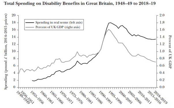
It’s possible that Mr Cameron is simply committing the old FactCheck sin of talking about spending in cash terms, not the real terms or percentage of GDP figures preferred by the IFS.
Or he could be using a different definition of “disability benefits”, perhaps including some benefits paid to disabled pensioners that are not covered in this analysis. But in terms of the main benefits paid to working-age sick and disabled people, real spending is going down not up.
Rising spending – even if true – would actually be a strange thing for the prime minister to brag about, given that the Conservative-led coalition hoped we would be spending considerably less on incapacity benefits by now.
Jonathan Portes from the National Institute of Economic and Social Research has blogged about this at length: there were supposed to be 2.1 million people on incapacity benefits by now, not 2.5 million, and an estimated saving of £3.5bn failed to materialise.
In other words, if we are spending more in cash terms on these benefits, that may be due to a failure of policy rather than a sign of compassion.
The verdict
The OBR handily sums up how the total welfare budget is carved up:
 A few things are immediately obvious.
Jobseeker’s allowance (black) makes up a surprisingly small slice of the pie – and it did not rise by much in the wake of the global financial crisis, compared to previous recessions.
Housing benefit (red) has been going up steadily, for straightforward reasons: more people are renting not owning; more people are renting privately; rents have risen faster than wages.
Labour massively ramped up tax credits (green), either as a means to cut pensioner and child poverty or, as Iain Duncan Smith put it yesterday “as a way of trying to buy votes” (or both).
Spending on incapacity and disability benefits (blue) increased significantly in the ’80s and early ’90s but successive governments, beginning with the Conservatives in 1995, have taken steps to reduce the numbers of claimants.
The slice eaten up by state pensions (purple) is expected to increase, as the population ages and governments continue to find it politically impossible to cut pensions.


