Will Grindr and Google Glass kill the map?
Humans have been making maps for at least 14,000 years, when one was scratched on a cave wall in Barcelona. But could new technology spell the end of this ancient tool?
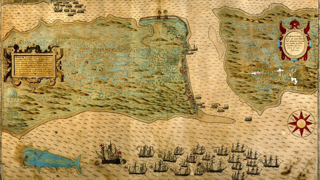
Human beings have been representing the world with flat pictures called maps for thousands of years. 14,000 as far as we know, the date of the world’s oldest map. That makes maps much older than writing – the first scratched words on stone date from only 5,000 years ago.
But could advances in technology make defunct this seemingly essential way of understanding the world? Some people think so. Paper maps seem destined for the graveyard, thanks to maps on phones and sat navs. But the whole idea of representing space on a 2D plane could be about to change again.
Chris Osborne works in geospatial analysis and visualisation and is the founder of GeoMob, a group for techies interested in geography. He puts it this way: a map is just one way of visualising space.
“One of the most obvious ways to look at the world is where things are. A map is a visualisation. It uses spatial data to achieve some task.”
One of the most obvious ways to look at the world is where things are. Chris Osborne
The thing is, other technologies can bring new ways of visualisation.
“What is being proposed as killing off the map is another visualisation, or another way of freeing some data so that it’s easier to navigate around, or get directions. It would be a new interface, a new way of looking at things, but all coming from the same root of spatial data.”
And these new visualisations get very different to what you learned about in geography class.
Exploding the map
The big agent of change is wearable technology, especially, Google Glass. Tech companies are betting big that devices next to our bodies – on our wrists, in front of our eyes – will be the new interface through which we interact with computers.
Google employees and technology journalists may be the only ones wearing the computerised spectacles with mini-screens right now, but it is likely that many more of us will be in the future. It only took mobile phones two decades to become ubiquitous in the developed world.
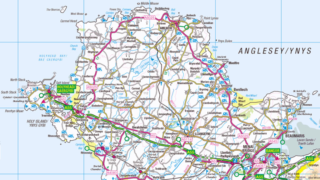
With Google Glass, you will not see the world like this:
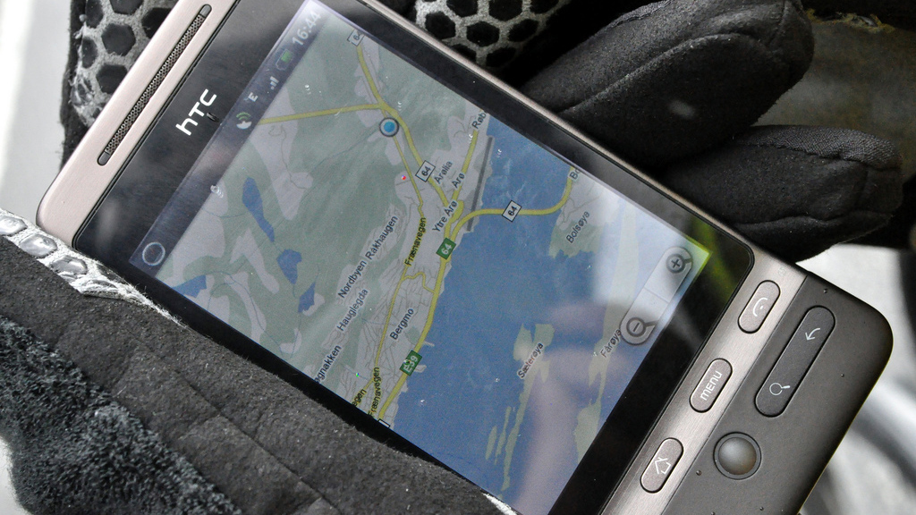
But rather like this:

The directions tool is still showing you location, but the map has been broken right down and reconfigured around what you can see out of your eyes.
You probably recognise this sort of visualisation from your sat nav. Google Glass just takes it one step further, lifting the direction arrow off the 2D plane and pinning it onto the real world. This is very far from the kind of map you learned about in school geography.
At the centre of the world
A big problem with old maps is not being able to work out where you are: we have all seen tourists fruitlessly turning them round and round. New maps do not have that problem. The user is almost always at the centre.
Darin Jensen, a geography academic at Berkeley University, argues that what we have on smartphones and sat navs has already become something other than a map: it is data with an interface.
“I argue that your iPhone map app is not a map, it’s actually just a database call-up that presents you with what looks like a map so you can locate yourself… it’s more related to our mental world, because when I’m picturing the world, I’m at the centre and I am that blue dot.
“I might look at your iPhone app and recognise it as a map, but that’s not stored anywhere as a map – it’s simply a call-up of database information.”
iPhone maps are more related to our mental world, because when I’m picturing the world, I’m at the centre. Darin Jensen
If we think of places like Glasgow or Hereford as a bunch of points of correlated latitude and longitude, it can seem banal or unromantic, but it opens up a lot of new ways to interface with where we are. That can really help people who struggle with traditional maps – and not just tourists. Take this example of a navigation tool for blind people, mentioned by Mr Osborne: “In one of the old Nokias they had navigation for visually impaired people,” he explains. “You enter where you’re going and, at its simplest, if you’re walking down the street, it would vibrate once to turn left and twice to turn right.
“It demanded very little attention because it was built into the way you do things. You could imagine some item of clothing, or some piece of wearable tech in 20 years’ time being used just like that.”
Submerging the map
There is another trend, too, in how technology uses location, and that is where points of interest – landmarks, whatever people are looking for – are lifted off the surface of the map. The rest – the roads, the fields, the landscape – is submerged so you cannot see it.
Here is a famous example:
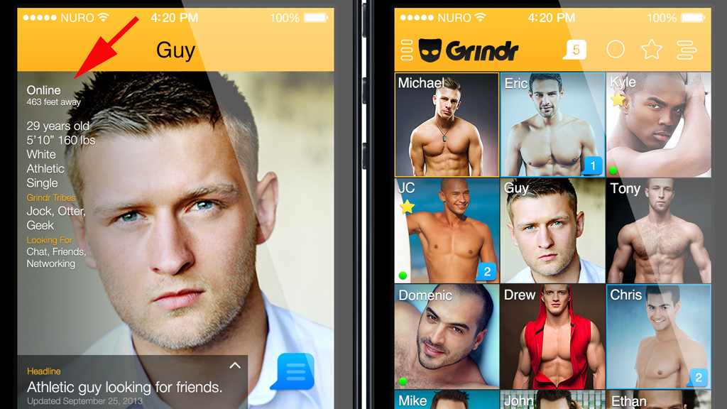
This is Grindr, a dating app for gay men that shows you singles nearby (see also the straight equivalent, Tindr).
This not a conventional image of the local area, but the app is all about location, who is where. It is not a map but it is built on spatial data, just with a different interface bolted on. This is increasingly common. The map or the space around you can be reorganised to focus on what you are interested in, from coffee shops onwards.
Many things, from photos you take on your phone, to store listings, come with locations built in.
“New applications will make location a lot more integrated in how you do things,” Mr Osborne says “and become much more under the surface.”
That is going to be an improvement on the way it is now – “the way a mobile phone works now, it demands a lot of your attention. You have to look at the screen, you have to start the application. Some of the best visualisation or mapping I’ve seen is so simple that you’re not thinking about it.”
Some of the best visualisation or mapping I’ve seen is so simple that you’re not thinking about it. Chris Osborne
“One of the best things I’ve seen in traditional mapping is property websites like RightMove. They won’t display a map for you to look at. But if you look at London property, there’ll be a little icon there saying “Farringdon station, 200m”.
“It’s an incredibly simple representation. You don’t even need to look at a map to understand that. Some of the best mapping applications are incredibly simple.”
The Grindr example shows another change in maps. Traditionally the key landmarks on a map were churches, lakes, post offices. New tech really blows open the possibilities for what the points of interest are.
Now it can be anything from single gay men, to coffee shops, to cycle paths, or even, children’s toys left lying around. Wikipedia-style maps like Open Street Map let people upload their own points of interests – real-ale pubs in Liverpool, nice walks.
Maps that fit our values
But then maps have always reflected what the map-maker thinks is important, and our maps are no different. Darin Jensen describes how European map-makers of the middle ages wrote their Christianity into their world, putting Jerusalem at the centre:
“The top half of the map would be Asia, the bottom-left quarter was Europe and the bottom right was Africa. Jerusalem was right in the centre, at the centre of the world. And the top of the map was oriented east because that was paradise, because that was how people viewed the world.”
If New Zealand ever becomes the world’s super-power, look at the maps made after that’s been the dominant culture for a long time and you’ll see that south is at the top. Darin Jensen, Berkley University
Our current maps are not much different.
“Putting north at the top of a map is northern hemisphere centrism that places the north at the top because of a belief in northern hemisphere dominance over the rest of the world,” Mr Jensen says.
“If New Zealand ever becomes the world’s superpower, look at the maps made after that’s been the dominant culture for a long time and you’ll see that south is at the top of the map, because why not.”
‘First we shape our tools’
But then it is not just that we make maps to fit our ideas. The maps we create end up defining how we think about space in the first place.
“There’s a quote I really like by Marshall McLuhan,” says Benedikt Gross, a programmer and designer who has worked as a visiting research fellow at MIT Senseable City Lab. “‘First we shape our tools and then they shape us.'”
An example he likes to use is the London tube map:

“The first intention of the London tube map was always to show the structure of the network. It was definitely not meant to be used as navigation or to compare distances in the city for people who live there.
“But what happened is that a lot of people are using the London tube map for that, and the tube map becomes the mental map of London – and that is really interesting.”
The tube map was not meant to be used as navigation. Benedikt Gross
It looks as if London Bridge and Bank are as far apart as, say, Bethnal Green and Liverpool Street, but Londoners will know that London Bridge and Bank are right next to each other.
This is what the London tube map would look like if it was mapped on real space:
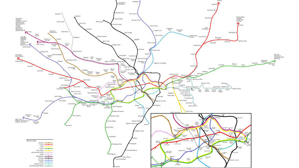
“Maps are a very classic example of the two faces of the tool: the first intention is to map out things, but then that ends up shaping your way of abstract thinking,” says Mr Gross.
So what we use to measure space, ends up defining how we understand it.
“Another example is the clock,” says Mr Gross. “Monks invented the clock to better measure the times of the day so they could pray at the right time. But the clock escaped the monasteries and then was used to measure other things like labour.
“And then people used it to compare work on an objective scale, and that was arguably a kickstarter for capitalism. And because people could compare work, it also increased individualism because of the notion that you were different to somebody else.”
The types of maps we have have already changed how we think about things and what we consider to be important.
“Map-making in the past was all about defining ownership – my field is 11 hectares, I own this, and your field is 20 hectares.”
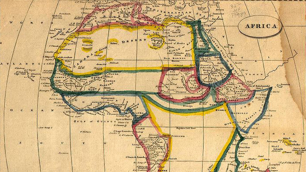
One of the most extreme consequences of modern cartography can be seen in Africa:
“In Africa they have a lot of straight lines. The borders of Ghana or Nigeria are just straight lines, and that is often because someone drew a line on a map to say this is a French colony, this is a British colony. It already happened that how we map changes how we live.”
Mr Gross is hesitant to predict how our me-centric maps, that can rearrange the world around to show us what interests us, will change our perceptions of space.
So it is quite possible that the rapid changes in how we measure and represent space could have an impact on how we understand it, on how we understand where we are.
Sense of perspective
But back to the humble 2D map with mountains and post offices. Mr Jensen argues that it will persist because we will continue to want a sense of perspective:
“It seems to me that if you’re seeing the map on the world in front of you, there’s no scale reduction. It’s one-for-one mapping.
“The thing about a real map is that I can understand the world around me. I can understand my distance in relation to San Francisco, which is 15 miles across the bay. Depending how large the map is, I can understand my relationship to London.
“I wouldn’t get any of that scalar relationship to the world if I’m just looking through this device that’s just telling me what’s ahead as far as vision allows.”
-
Latest news
-
Windrush scandal: returning to the UK after a forty year wait6m

-
Netanyahu ‘survival’ depends on ‘expanding war’ says head of Palestinian National Initiative5m
-
Proposed law change could strip parental rights from paedophiles5m
-
Hugh Grant settles privacy lawsuit against The Sun newspaper publisher2m
-
Post Office Scandal: what did top executive know?6m
-


